
News & Insights
When Data Talks Out of Both Sides of Its Mouth
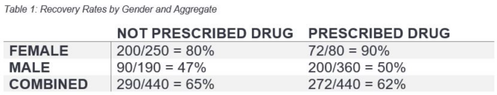
Imagine that you are a clinical physician recommending a promising new drug that has been shown to reduce the risk of heart attack in at-risk patients. At the end of the year, you ask one of your attending physicians to build an Excel sheet breaking down the efficacy of the drug in your patients. Your attending comes back to you with a surprising result: prescribing the drug actually decreases the likelihood of making a full recovery! 62% of the people prescribed the new drug made a full recovery, while 65% of those not prescribed the drug made a full recovery! Meanwhile, your resident data analyst comes back with something that shocks you even more: the new drug increases the likelihood of making a full recovery in both men and women!
How can that be? How can the new drug be better for both men AND women, but worse for people overall? Well, my friends, this is Simpson’s Paradox at work.
Take a moment to reflect on the data and see if you can piece together what’s going on. Those who haven’t had their morning coffee or find it pedantic when a post says “Try this at home!” can read on.
The issue is related to confounding factors, which interested readers can explore at length in Judea Pearl’s The Book of Why. Namely, males are at higher risk overall. Since males are more likely to suffer from heart attacks, their sample size is larger and they were more likely to be prescribed the drug. While none of the arithmetic is wrong, by not correctly splitting or correcting for confounding factors, the data leads to erroneous conclusions! (In this case, that the drug hurts rather than hinders.)
A brilliant resource to learn more about Simpson’s Paradox, and dive into even greater detail, can be found at Paul van der Laken’s blog.
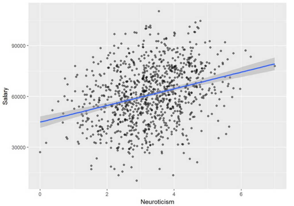
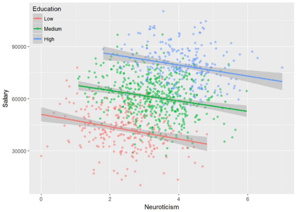
For now, I’ll leave you with the below pair of charts showing how Simpson’s Paradox can cause us to be completely and utterly wrong about our interpretation of the data without correcting for confounding factors. The first chart (incorrectly) shows that more neurotic people tend to earn more. In this case, the confounding factor is that higher educated people are more likely to have high neuroticism. In reality, highly educated people are more likely to both earn more and be more neurotic. This causal relationship confounds the correlation between salary and neuroticism: for a given education level, neuroticism is negatively correlated with salary.
ABOUT THE AUTHOR

DISCLAIMER:
This blog and its contents are for informational purposes only. Information relating to investment approaches or individual investments should not be construed as advice or endorsement. Any views expressed in this blog were prepared based upon the information available at the time and are subject to change. All information is subject to possible correction. In no event shall Viewpoint Investment Partners Corporation be liable for any damages arising out of, or in any way connected with, the use or inability to use this blog appropriately.