Geek Level:
Read Time:

When an individual contemplates whether they want to make an investment, generally the first thoughts revolve around return expectations. If I am willing to invest in a company, either through debt or equity, what is my expected return, and is the return enough for me to feel comfortable with the risk of supplying capital to that company? When saving for retirement, individuals tend to work backwards from a terminal portfolio value sufficient to support their lifestyle in order to determine the return required to hit that target. The concept of risk management is generally an afterthought, playing second fiddle to the more amygdala stimulating notion of spectacular returns and riches. Even in the investment management industry where “return per unit of risk” (the Sharpe ratio) is supposedly a well-understood concept, the idea of managing risk as the predominant factor in an investment portfolio is not widely embraced.
At Viewpoint Investment Partners, we’re hoping to offer you an alternative view of risk. Like in the movie The Matrix when Neo is prompted to take either the red or blue pill, with the red pill allowing Neo to see the truth, the truth about investing is that risk mitigation is investing. As the father of value investing, Benjamin Graham once said, “the essence of investment management is the management of risks, not the management of returns.” The challenge is that investors generally think of risk mitigation as a liability, or a trade-off against wealth creation. However, by accepting the red pill, you will see that risk mitigation is not a liability; rather, risk mitigation can be additive to portfolio returns if used in an efficient manner. As the ancient Stoics taught, we need to “control what we can control.” Because investing in financial markets is rife with uncertainty, the one thing we as investors can control is the design of efficient risk management systems to get us closer to our goal of a higher ending portfolio value.
A well-known saying in the investment world is that compound growth “is the eighth wonder of the world;” however, the concept of how volatility (risk) impacts compound growth, and thus the terminal value of an investment portfolio, is intuitively tricky for the human brain to master. The brain has a relatively easy time understanding the concept of arithmetic returns, where -50 + 50 = 0. Arithmetic returns can be added together and are independent of the order in which they occur. However, when you are dealing with compound growth in the context of an investment portfolio (or general wealth), returns on the portfolio have an iterative, multiplicative impact on the next period, what is known as a geometric sequence; the path of returns matters because those returns are compounded over time. One of the reasons the geometric sequence is hard for the brain to master is because we generally experience life in linear function, one thing after another, much like with how arithmetic returns occur.
To illustrate this concept, say you start with a portfolio value of $100. You invest your money in an extremely speculative health tech company that has purported to have revolutionized blood tests. In the first year, there are worries about the feasibility of the technology and the stock drops -50%. The next year, the company lands a major partnership with a grocery store chain and the stock shoots up +50%. Simple arithmetic would tell us that these two periods would cancel out and your portfolio would be whole again. However, after the initial drop of -50% in year one, your portfolio is now worth $50 and the subsequent +50% gain in year two only gets you back to $75. For your portfolio to be whole after the -50% loss from period one, you need a return of +100% in period two! Therefore, when you are dealing with geometric returns, the greater the loss, the greater the profit is needed to get back to even. This is where the geometric average holds more economic value over the arithmetic average, as the multiplicative impact of a large loss leaves the portfolio with a much lower capital base from which to compound during the next period.
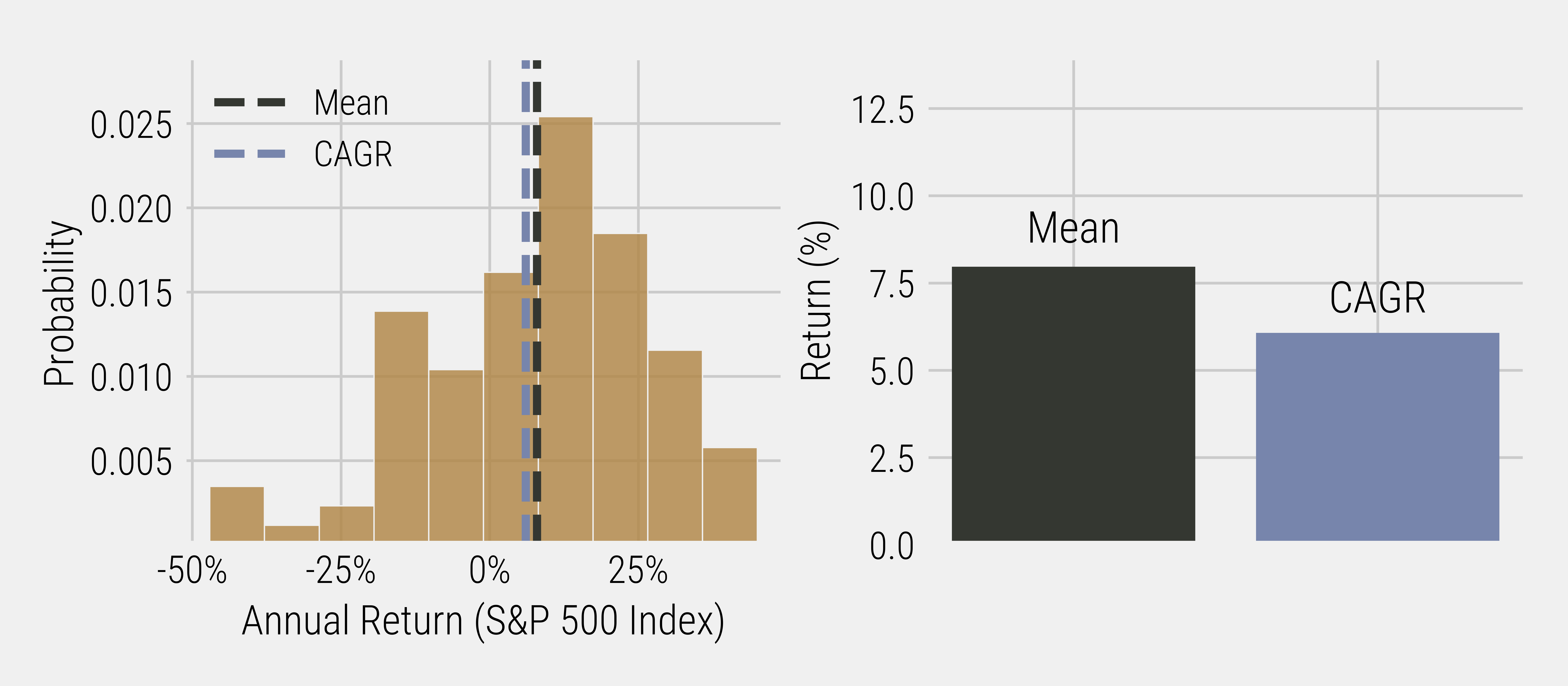
To drive home this point about arithmetic versus geometric averages, let’s look at the yearly return profile of the S&P 500 (Figure 1). You can see from the graph that the average yearly return (arithmetic mean) of the S&P 500 is 7.9%. However, if you view this instead from the perspective of an investment portfolio, the result is much different. Had you invested $100 in the S&P 500 in 1928, your ending portfolio value in early 2022 would be $24,634. Now, all things considered, that is a wonderful terminal value, but when you unpack those numbers, the ending value works out to be a compound annual growth rate (geometric return) of only 6.1%. This is an astounding gap of 1.8% relative to the average yearly return! The difference between the two returns is a concept known as volatility drag, an implicit cost to investment portfolios where drawdowns in the capital base lead to a lower value from which the portfolio can grow. Volatility drag is an insidious implicit cost that often goes unnoticed by only focusing on arithmetic averages.
Figure 1: S&P 500 Index Annual Return Data (1928 – 2022)
If the concept of volatility drag wasn’t bad enough, academic research has shown that volatility can also lead to sub-optimal decision making. In a recent academic paper called “When Do Investors Freak Out? Machine Learning Predictions of Panic Selling,” the authors find that investors are susceptible to panic selling during sharp market downturns. These so called “freak-outs” by the amygdala are not only predictable but also fundamentally different from the disposition effect and other previously studied behavioural finance anomalies. The irrational behaviour in periods of elevated volatility results in the median investor who “freaked-out” earning a zero to negative return after they engage in panic selling behaviour. More alarmingly, roughly 30% of investors who engaged in panic selling behaviour never return to reinvest in risky assets (i.e. stocks), meaning they effectively have crystalized their losses with a permanent impairment of capital.
Now that we have explored why thinking about portfolio returns in geometric terms matters, and how volatility can lead to sub-optimal decision making, our aim will be to showcase how risk management doesn’t just aim to reduce risk in an absolute fashion; it can simultaneously allow you to take on more risk!
Making Friends With Trend
The concept of a “momentum” premium in financial markets is well-documented in academic literature. At a high-level, isolating the momentum factor involves being long recent winners and short recent losers. Doing so results in a “factor” premium, supporting the theory that it takes time for market participants to accurately absorb new information. The momentum factor is constructed cross-sectionally, meaning an asset’s momentum is compared to the momentum of other assets. The “trend” factor is a similar concept, but constructed using time series momentum, meaning it focuses exclusively on an asset’s own past returns. In academic literature the momentum factor is isolated to generate a premium over and above the return offered by the broad equity market, but for practitioners, the trend factor is often used as a risk management tool in portfolio construction. For the remainder of this blog, we will introduce the trend factor and some of the variables to consider when implementing trend as part of a risk management strategy.
One of the simplest ways to identify the “trend” of the market is to look at the current price of an asset relative to the 200-day moving average of its price. For our commentary, when we speak of the “market” or “equity” we will be referring to the S&P 500 equity index. If the current price of the index is above the 200-day moving average, the market is classified as being in an “up-trend.” If the price of the index is below the 200-day moving average, the market is classified as being in a “down-trend.” A simplistic implementation of the trend factor for risk management purposes would be for a portfolio to be invested in the equity market whenever price is above the moving average; when price is below the moving average, the portfolio would “sell-out” of the equity market and move to cash. We will ignore trading costs for this introductory analysis, but we will revisit this assumption in the future to get closer to real-world conditions.
Figure 2 shows a comparison of the cumulative returns for the trend factor relative to an equity-only strategy for the last twenty years. Investing in the equity market with no trend overlay would have resulted in a higher terminal value than if a trend overlay strategy had been used; however, looking at only absolute returns does not tell the full story. Part of the rationale for implementing a risk management strategy like the trend factor is to reduce the volatility of your investment portfolio so that you don’t make irrational decisions during times of financial market stress.
Figure 2: Cumulative Growth of S&P 500 vs. Trend Overlay (2002 – 2022)
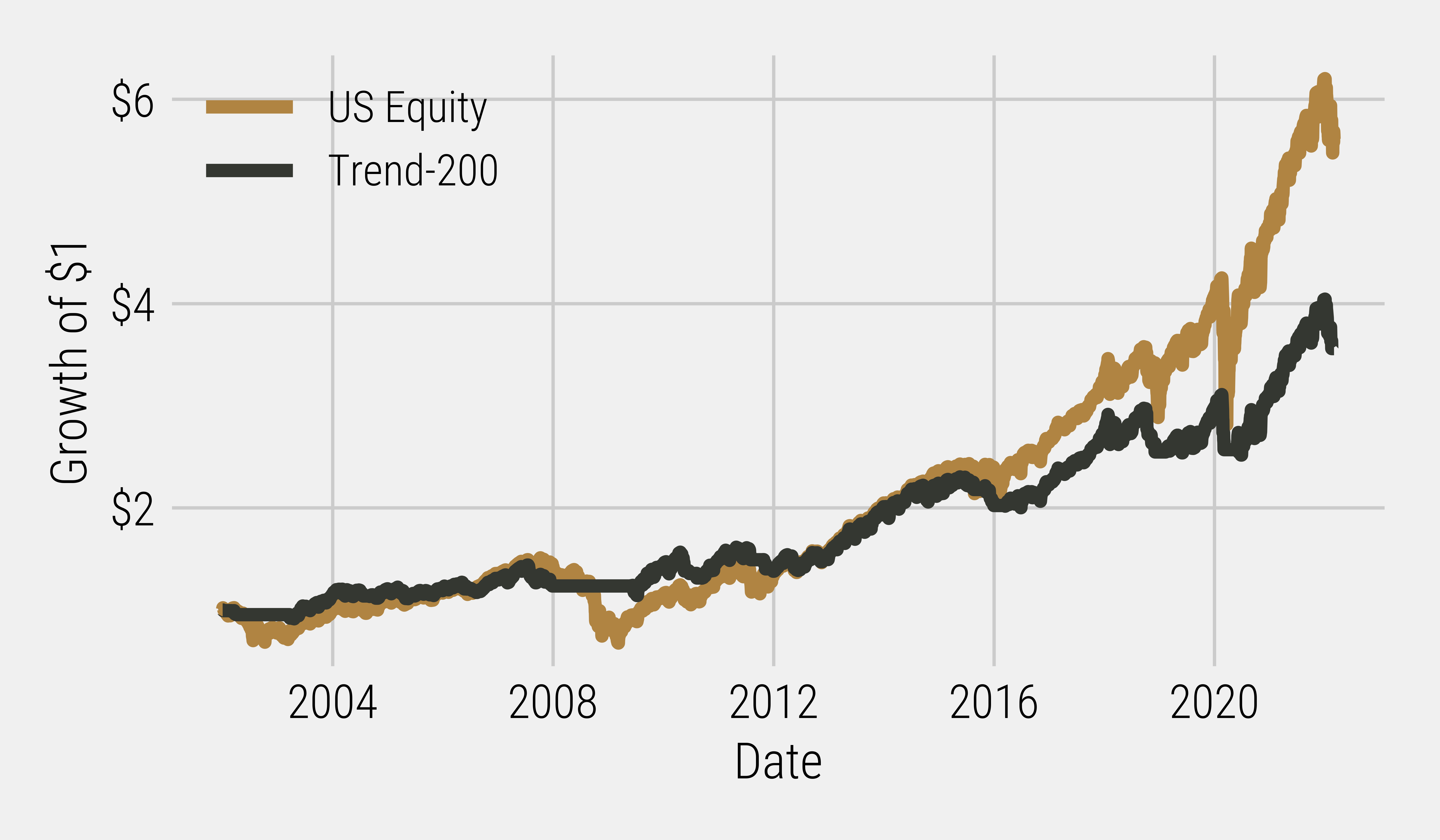
Figure 3: Return Table: S&P 500 vs. Trend Overlay (2002 – 2022)

Figure 3: Return Table: S&P 500 vs. Trend Overlay (2002 – 2022)
*The Sharpe ratio is calculated as the return over the period minus the risk-free rate (3-month T-bills) divided by volatility.
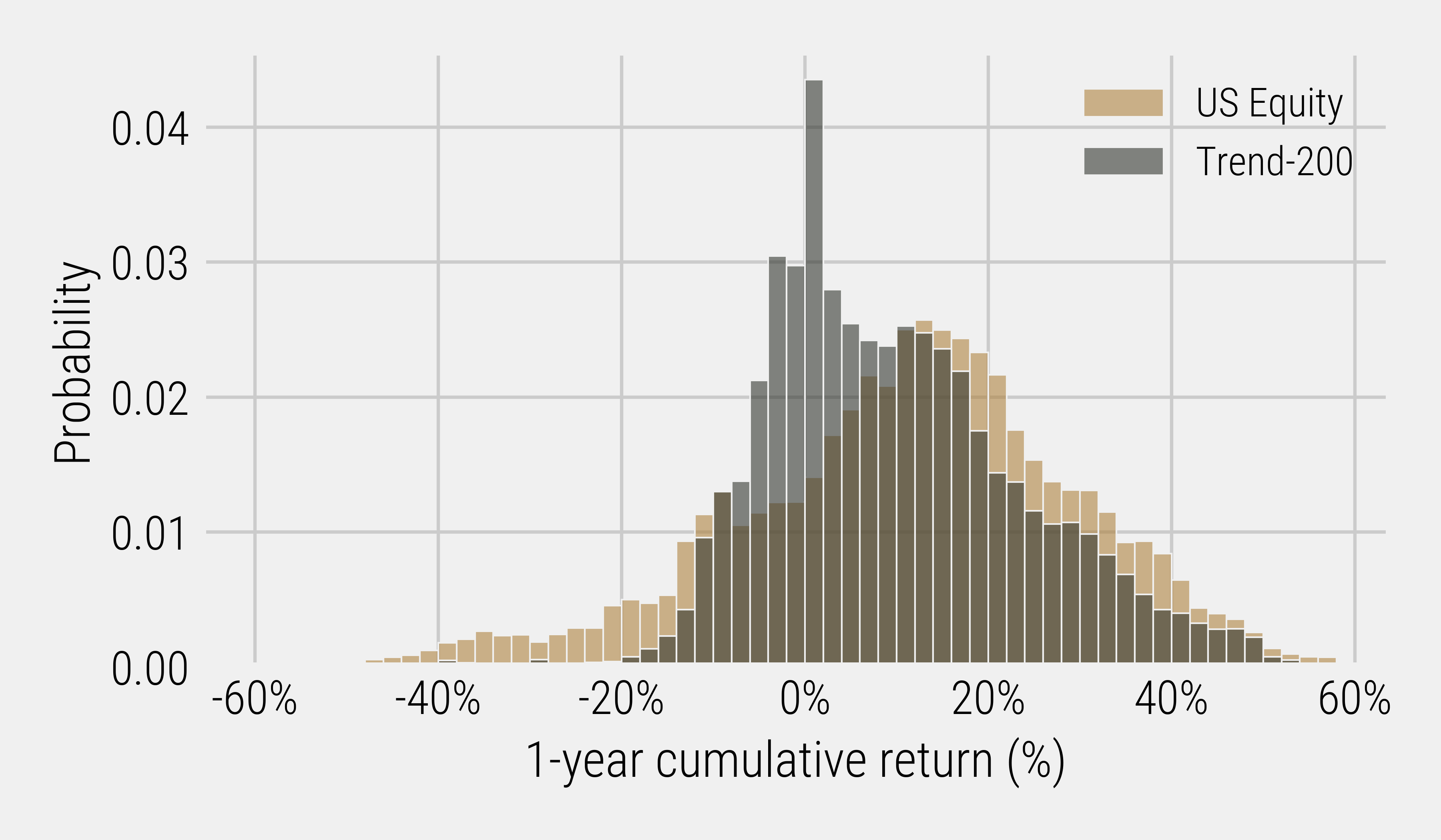
Visually, you can see this volatility reduction at work as the trend factor eliminates a substantial chunk of the left-tail distribution inherent in an equity-only strategy (Figure 4). Investors with an equity-only portfolio have experienced some eye-watering one-year drawdowns over the last twenty years!
Figure 4: One Year Cumulative Return Distribution: S&P 500 vs. Trend Overlay (2002 – 2022)
A common rebuttal from investors is that they don’t succumb to behavioural biases and are able to withstand higher volatility in the quest for higher returns. However, simply being aware of behavioural biases does not allow investors to circumvent their amygdala; thus, the notion of “higher risk = higher return” needs to be re-examined in the context of risk-adjusted returns.
To better visualize the benefit of achieving a higher Sharpe ratio, we can scale the volatility of trend overlay strategy so that it is equal to the volatility of the equity-only strategy, putting both strategies on an even playing field from a risk perspective. When you equate the volatility of both strategies (Figure 5), the trend overlay now has a higher terminal value than the equity-only strategy. This is what we call eating your Sharpe!
Figure 5: Cumulative Growth of S&P 500 vs. Trend Overlay (2002 – 2022)
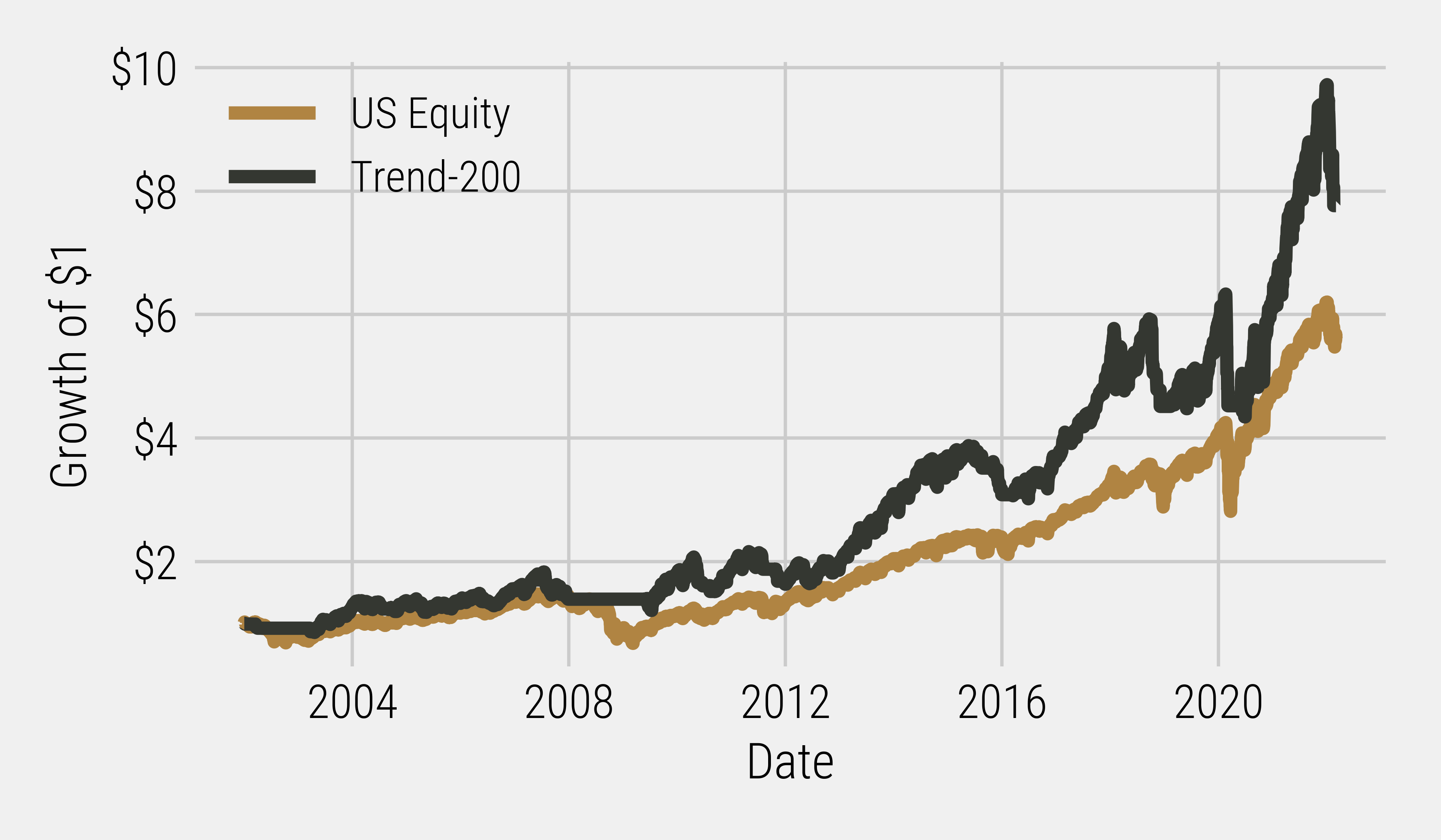
*Volatility scaled, not actual returns
Enter the Matrix
One critical item to point out is that the previous analysis is done on historical data – what we would call a backtest in investment parlance. One of the limitations of a backtest is that there has only been one historical return path. This can turn out to be a pitfall for investment strategies that are overly conditioned to the historical data, as there is no guarantee a similar structure will materialize in the future. This is why there is a running joke in the finance industry that no one has ever seen a bad backtest. To combat this overfitting problem, we need to make sure our thesis of utilizing the trend factor as a risk management tool is robust to a variety of potential return paths.
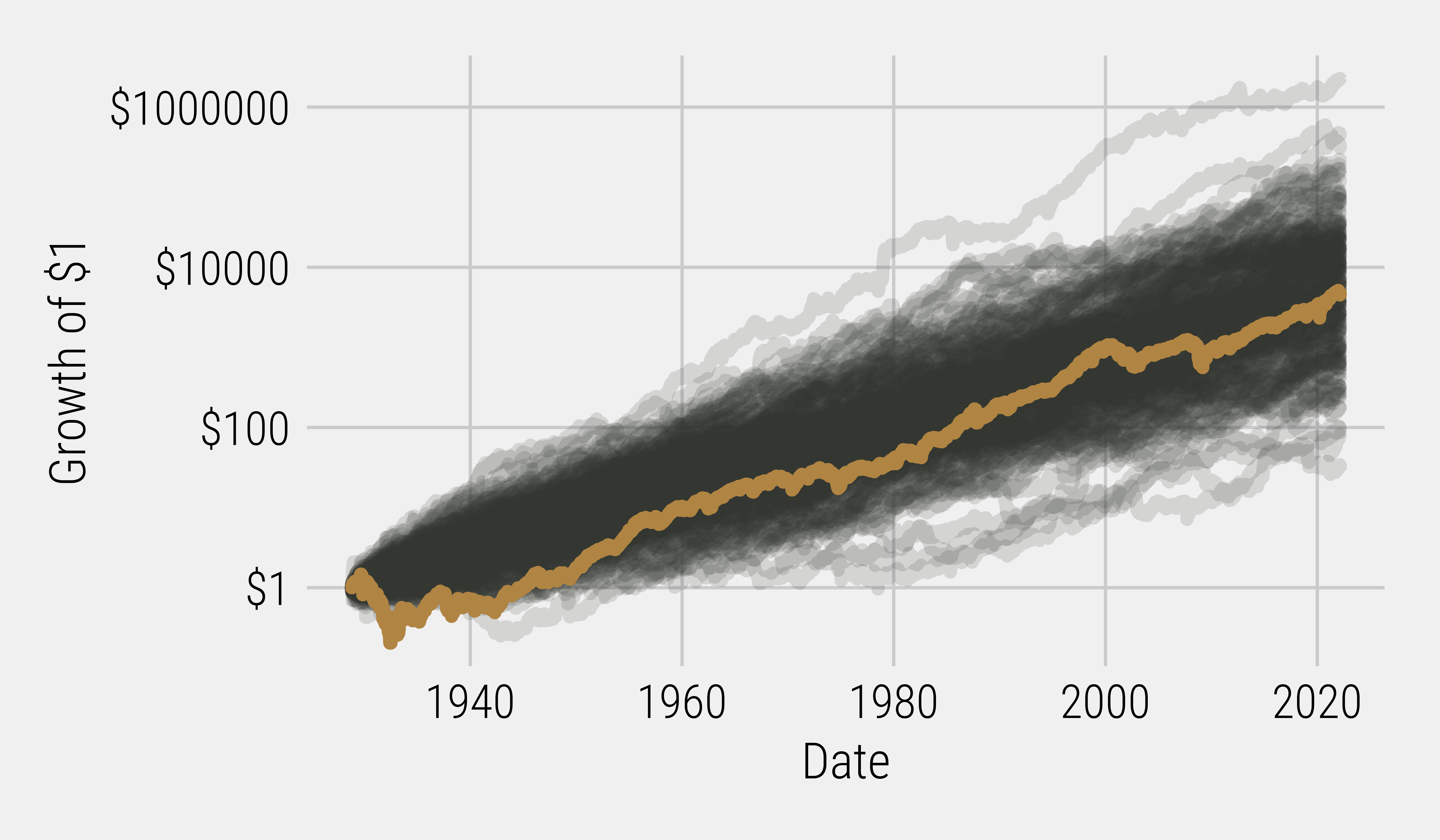
To test the robustness of the trend factor, we can create alternative realities (hat tip to the Matrix) by applying a stationary bootstrap resampling of historical equity market returns. This allows us to effectively splice together an ensemble of “alternative realities” represented by different permutations of sequential blocks of realized equity returns. Figure 6 shows this process playing out, with 200 different histories for the S&P 500. The gold solid line shows the actual path of the S&P 500, but you can see there are many different paths that could have theoretically materialized (the black lines). This is important for our trend analysis as we want to make sure if we follow Morpheus down the rabbit hole into an alternative reality (another Matrix reference), we can still observe a persistent and reliable trend premium resulting from superior risk management.
Figure 6: Bootstrapped Resampling of S&P 500 Returns – 200 Simulations (1928 – 2022)
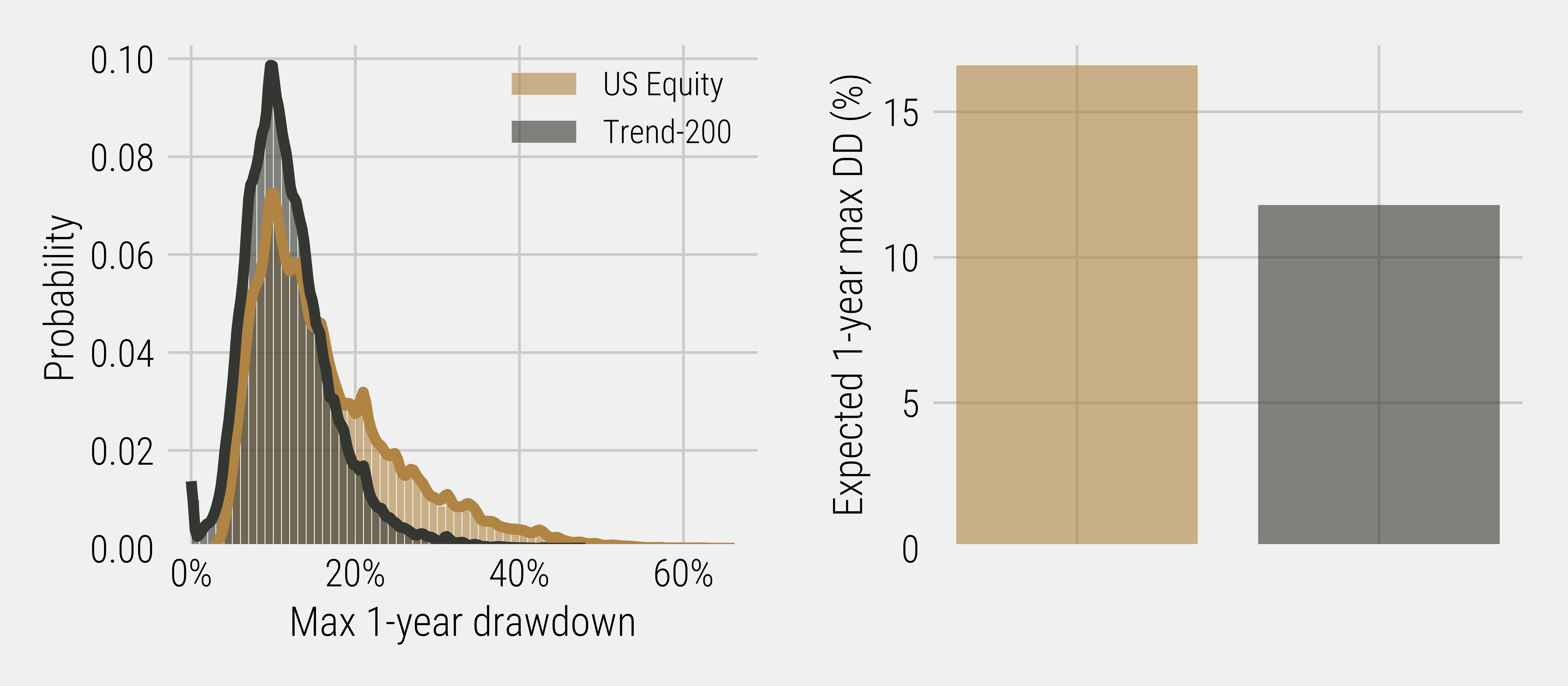
With a much larger sample of different return paths for the S&P 500, we now have a more robust data set with which to test our hypothesis. The output of the bootstrapped resampling shows the trend overlay strategy still succeeded in reducing the probability of severe one-year drawdowns relative to an equity-only strategy (Figure 7).
Figure 7: Bootstrapped Resampling of S&P 500 vs Trend Overlay – 200 Simulations – Max One Year Drawdown Probability (1928 – 2022)
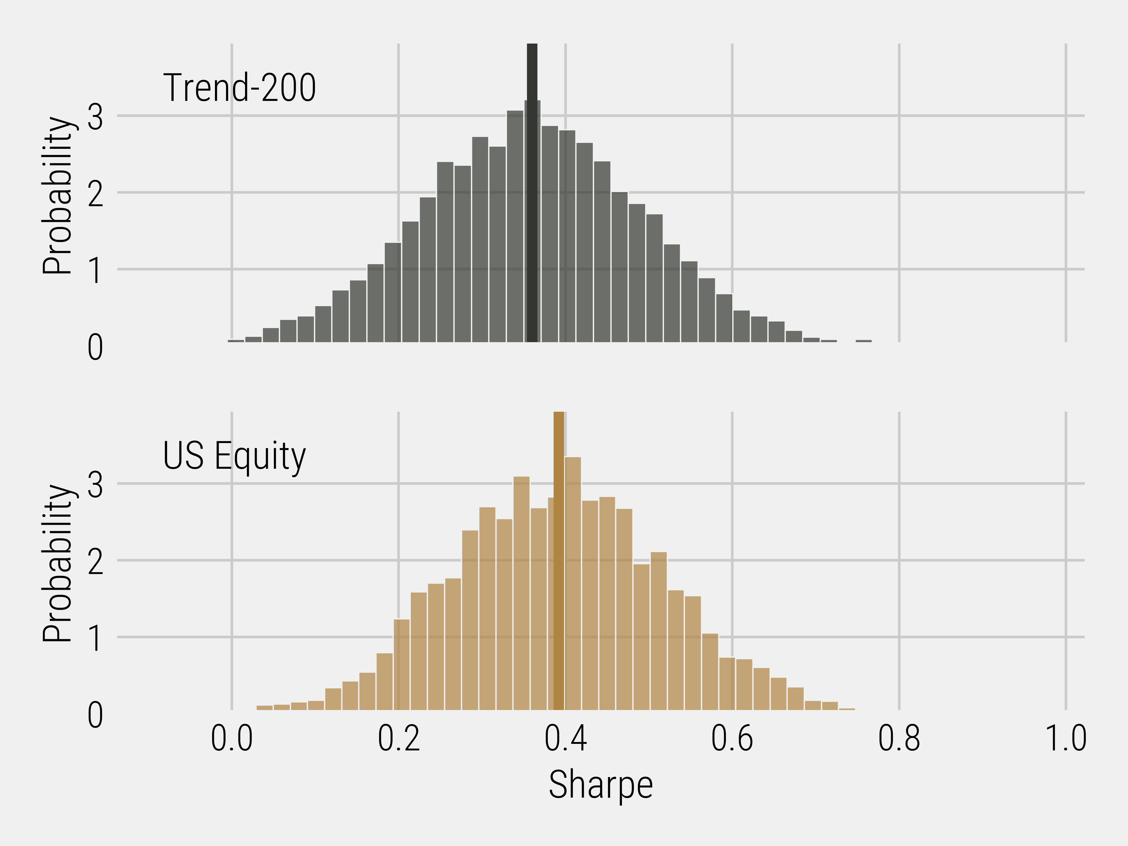
However, analyzing the distribution of Sharpe ratios (Figure 8) leads to some interesting discussion points. Unlike in our historical example where the Sharpe ratio of trend overlay outperformed equity-only, in the bootstrapped resampling analysis the median Sharpe ratio of the trend overlay is now lower than that of equity-only. This raises the question: while the trend overlay may have historically worked the best over the last twenty years, was this just a lucky return path? Based on what our bootstrapped resampling work is indicating, it appears this may be the case.
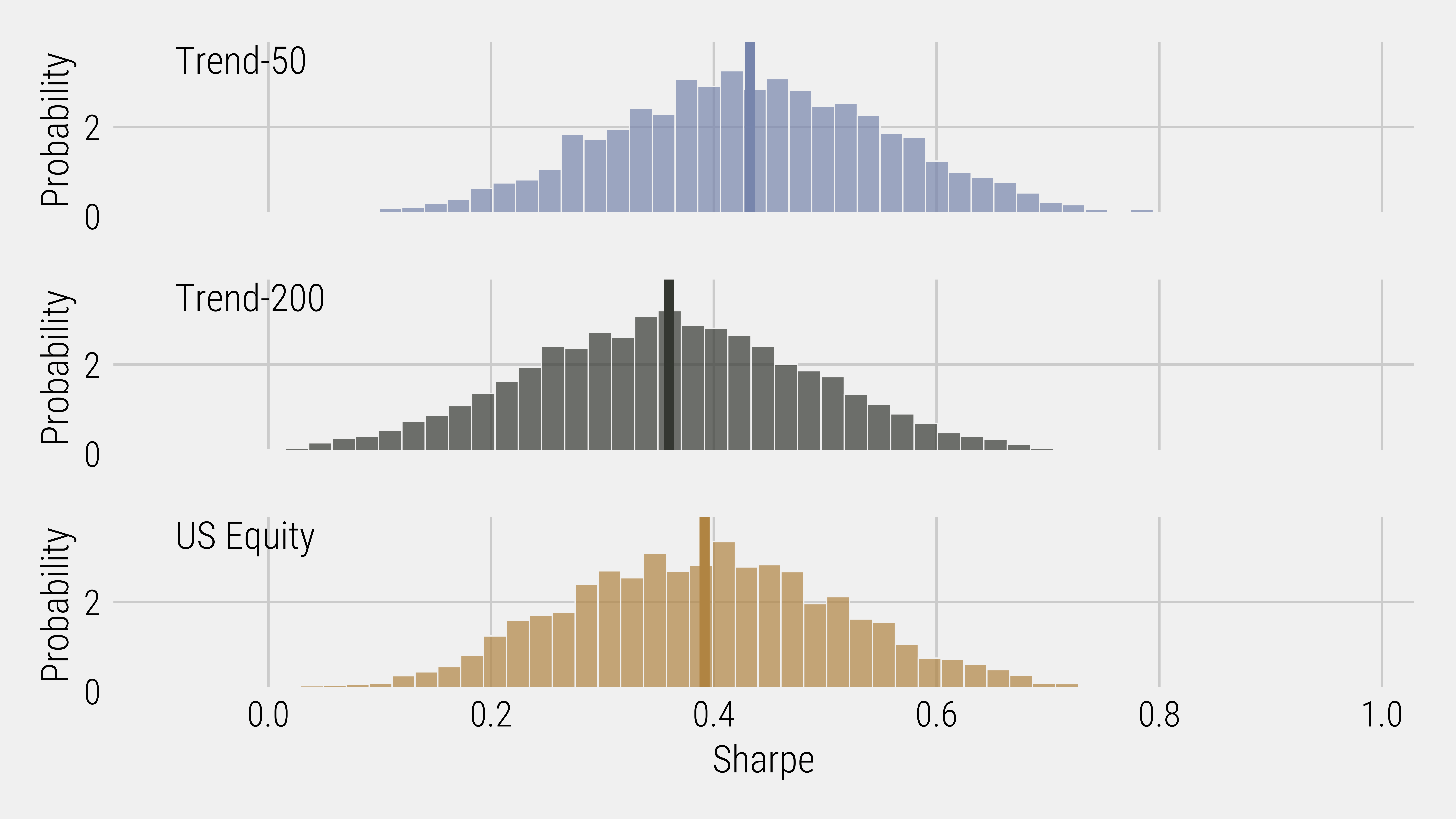
Figure 8: Bootstrapped Resampling of S&P 500 vs Trend Overlays 1,000 Simulations – Sharpe Ratios (1954 – 2022)
However, before we conclude that our thesis is invalid due to the bootstrapped resampling data, we’d like to revisit our earlier assumption around the timescale for the trend overlay indicator. Because there is no fundamental rationale saying that the 200-day moving average should be the relevant timescale for identifying the transition between bull or bear markets, we can also examine alternative timescales and their ability to accurately signal the underlying “trend” of the market. In this case, we can shrink the timescale to a 50-day moving average to analyze whether a shorter time horizon may work as a better indicator for our trend overlay. While a shorter timescale is likely to lead to a higher propensity for false signals when identifying market regimes, it could seemingly be more reactive to short bursts of equity market weakness, potentially moving faster to protect capital in times of financial stress. Re-running our bootstrapped resampling data to now include the 50-day moving average as a trend overlay strategy, we now have an additional lens through which to view the application of our trend factor. We can see from Figures 9 and 10 that not only does the trend-50 reduce the expected maximum one-year drawdown, likely due to faster reactivity, but also that its Sharpe ratio distribution is superior to both the original trend-200 and the equity-only strategies. This portion of our analysis should not be confused with “throwing spaghetti at the wall to see what sticks,” but as a risk management tool to reduce the probability of implementing a strategy or factor that has a large “specification” risk.
Figure 9: Bootstrapped Resampling of S&P 500 vs Trend Overlays – 200 Simulations – Max One Year Drawdown Probability (1928 – 2022)
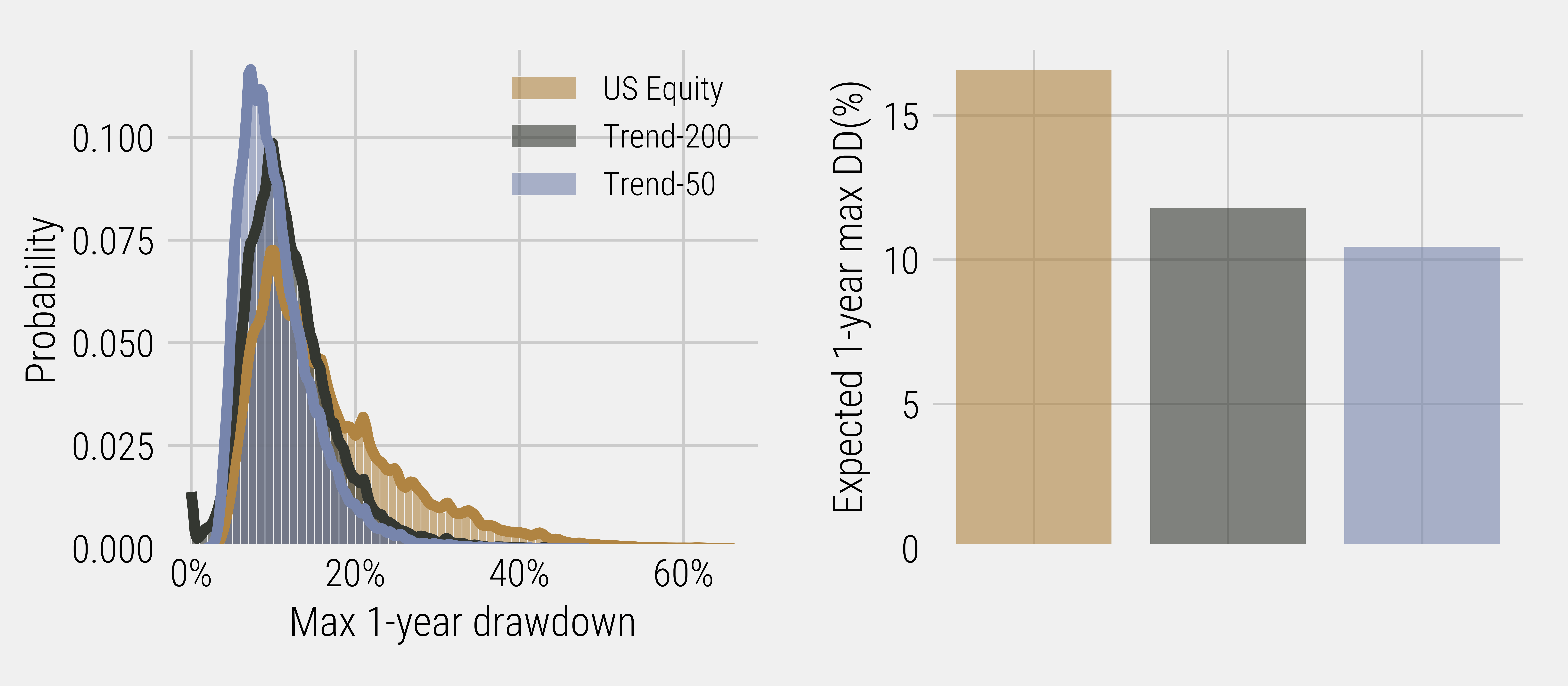
Figure 10: Bootstrapped Resampling of S&P 500 vs Trend Overlays – 1,000 Simulations – Sharpe Ratios (1954 – 2022)
Cue the Ensemble
Going back to our historical analysis, I want to home-in on two specific time periods to illustrate what is at stake when it comes to specifying a timescale for the implementation decision. The Great Financial Crisis of 2008 (GFC) and the COVID-19 panic of early 2020 are shown in Figure 11. During the GFC (top plot) you can see that trend-200 and trend-50 exited the market at approximately the same time at the onset of the crisis. However, the reactivity of trend-50 caused this strategy to get back into the market quicker than the trend-200 strategy, causing the portfolio to have a greater chance of observing false signals, and therefore falling victim to these so-called ‘head fakes.’ A false signal is what happens when a strategy gets back into the equity market assuming the drawdown is over, only to get hit with another big correction. During the GFC, the higher propensity of false signals relative to trend-200 caused trend-50 to underperform.
Figure 11: S&P 500 vs Trend-50 vs Trend-200 (Top: 2007 – 2010), (Bottom: 2019 – 2020)
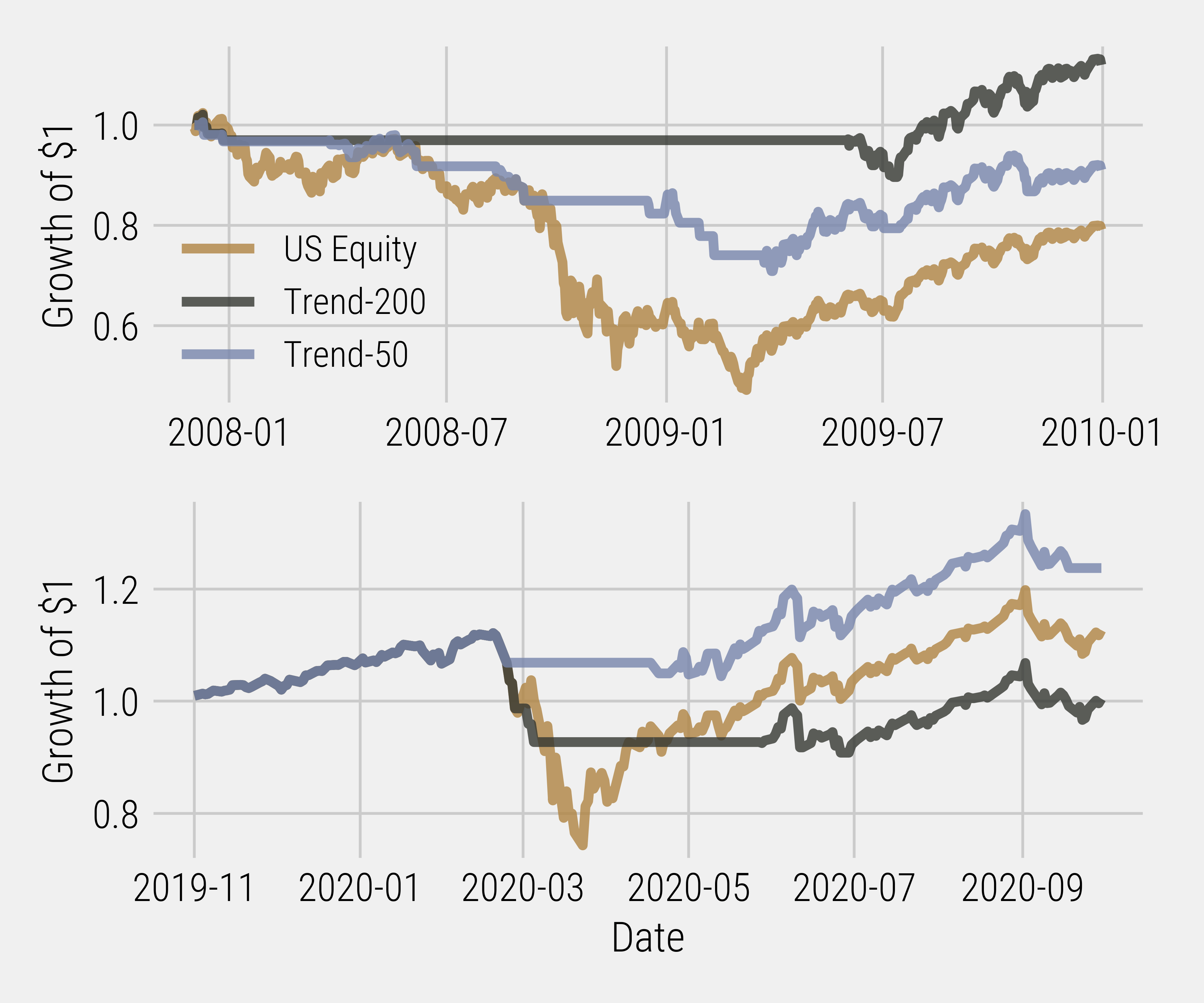
When we look at the price action during the COVID-19 drawdown, a different story materializes: all three strategies were “in-the-market” with long equity exposure up until February of 2020. At the onset of the COVID-19 drawdown, the trend-50 exited the market prior to trend-200, which didn’t exit the market until roughly a week later. As a result, trend-200 experienced a more significant hit to its capital base because of this sharp drop in equity markets. In addition, because the reactivity of trend-200 is slower than that of trend-50, trend-200 didn’t signal to get back into the market until a month after trend-50. Not only did trend-200 have a more significant hit to its capital base, but it also missed out on more of the rebound in equity markets than trend-50 did! This experience is in stark contrast to the GFC, as the lower reactivity of trend-200 became a double-edged sword during the COVID-19 bear market. While it didn’t suffer from any head-fakes, the opportunity cost of moving slower was on full display.
Even though we have shown that the trend factor can help improve investment risk management strategies, it should be clear that the choice of timescale is very important for efficient implementation. Without being able to accurately forecast what the next bear market will look like from a regime perspective, choosing a single trend metric increases the probability of our risk management strategy not being able to deliver as expected. One of the ways investors can alleviate specification risk is by implementing an “ensemble” of various timescales in order to reduce the reliance on one specific period. A simplistic example of such an ensemble could be four different moving averages, and when each signal occurs, the strategy enters/exits 25% of its position. This way, the strategy is not overly reliant on any one timescale, and the risk management strategy starts to look more like a “dimmer” (gradual adjustment of equity exposure) rather than a “light-switch” (full equity exposure or no equity exposure). At Viewpoint, we harness ensembles as part of our risk management framework, and in the next instalment of this blog series we will further explore why the implementation of ensembles allows for a better fine tuning of parameters to generate more robust risk management strategies.
DISCLAIMER:
This blog and its contents are for informational purposes only. Information relating to investment approaches or individual investments should not be construed as advice or endorsement. Any views expressed in this blog were prepared based upon the information available at the time and are subject to change. All information is subject to possible correction. In no event shall Viewpoint Investment Partners Corporation be liable for any damages arising out of, or in any way connected with, the use or inability to use this blog appropriately.


